ARLIGHT | Brand Evolution & Lighting Catalogue Ecosystem
Overview
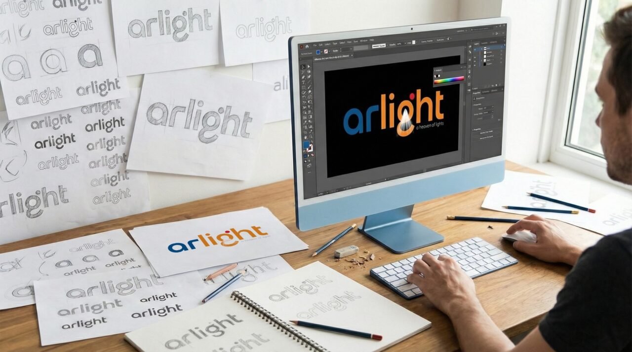
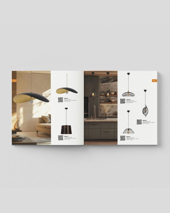
The Project ARLIGHT, a prominent brand in the lighting sector, required a comprehensive visual upgrade to reflect its expanding market authority. BLADEadv was tasked with executing a strategic brand evolution, encompassing a meticulous logo redesign and the creation of their new, extensive commercial lighting catalogue.
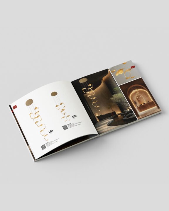
The Challenge The core challenge in rebranding an established company is modernizing the visual language without losing its roots. We needed to project a minimal, highly robust, and architectural aesthetic while strictly preserving the brand’s historic color palette, which serves as a vital nod to the company’s origin and heritage. Furthermore, this strong new identity had to translate flawlessly into a massive product catalogue, organizing complex technical data with elegance.
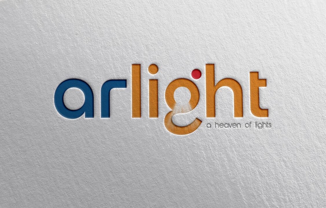
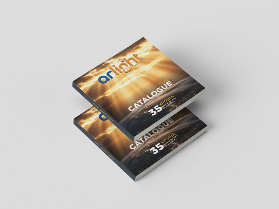
The Solution We developed a powerful new logo driven by strong, authoritative typography, establishing a sturdy and minimalist corporate presence. By strategically retaining the original color DNA, we successfully bridged the company’s proud history with a forward-thinking vision. This refined aesthetic was then systematically rolled out across their new commercial catalogue, transforming dense lighting specifications into a sleek, premium editorial experience that commands attention in the B2B sector.